I. Introduction
Designing aesthetically pleasing and impactful visuals is an art, and at the core of this art lies the fascinating world of color theory. From conveying emotions to influencing user behavior, understanding color theory is pivotal for designers. In this comprehensive guide, we’ll delve into the basics of color theory, explore its applications in design, and discuss the psychological nuances associated with different colors.
A. Brief overview of color theory
Color theory is a conceptual framework that helps designers make informed decisions about color combinations. It encompasses principles and guidelines that govern the use of colors in various design applications.
B. Importance of color in design
Colors play a crucial role in conveying messages, creating visual interest, and influencing user perceptions. Designers harness the power of colors to evoke emotions and establish brand identities.
II. Basics of Color Theory
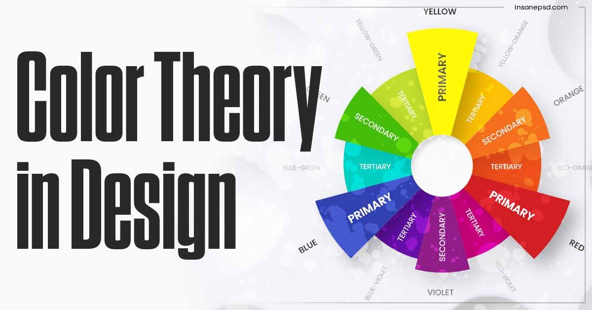
A. Primary colors
Primary colors, including red, blue, and yellow, are the foundation of all other colors. Understanding their properties is essential for creating harmonious color palettes.
B. Secondary colors
By mixing primary colors, we obtain secondary colors (green, orange, and purple), expanding the color spectrum.
C. Tertiary colors
Tertiary colors result from combining a primary color with a neighboring secondary color, offering a broader range of options.
D. Color wheel explanation
The color wheel serves as a visual representation of color relationships, aiding designers in creating balanced and visually appealing compositions.
III. Color Schemes
A. Monochromatic
Monochromatic color schemes involve using variations of a single color, creating a cohesive and harmonious look.
B. Analogous
Analogous color schemes use colors that are adjacent on the color wheel, providing a balanced and unified appearance.
C. Complementary
Complementary color schemes involve using colors opposite each other on the color wheel, creating a vibrant and dynamic contrast.
D. Triadic
Triadic color schemes involve three colors equidistant from each other on the color wheel, offering a diverse and balanced palette.
IV. Psychological Impact of Colors
A. Warm vs. cool colors
Understanding the emotional impact of warm (reds, oranges, yellows) and cool (blues, greens, purples) colors is crucial for conveying specific moods in design.
B. Cultural influences on color perception
Colors can carry different meanings in various cultures, making it essential for designers to be mindful of cultural nuances.
C. Emotional associations with colors
Different colors evoke distinct emotions; for example, red symbolizes passion and energy, while blue conveys calmness and trust.
V. Color in Branding
A. Importance of color in branding
Colors play a pivotal role in brand recognition and can influence consumer perceptions and behaviors.
B. Successful brand examples
Analyzing brands like Coca-Cola and McDonald’s reveals how consistent color use contributes to brand identity.
VI. Practical Applications
A. Color in web design
Choosing the right color palette in web design enhances user experience and reinforces brand identity.
B. Color in graphic design
Graphics come alive with effective color choices, capturing attention and conveying messages with impact.
C. Color in marketing materials
From brochures to advertisements, color decisions in marketing materials influence how the audience perceives a brand or product.
VII. Tips for Effective Color Use
A. Contrast and readability
Ensuring sufficient contrast between text and background colors is crucial for readability and user engagement.
B. Consistency in color usage
Maintaining consistency in color choices across various design elements creates a cohesive and polished visual identity.
C. Accessibility considerations
Designers must consider color accessibility to ensure that their creations are inclusive and can be enjoyed by individuals with visual impairments.
VIII. Tools for Color Selection
A. Online color palette generators
Numerous online tools help designers create harmonious color palettes effortlessly.
B. Design software features
Advanced features in design software enable precise color selection, enhancing the creative process.
IX. Case Studies
A. Before-and-after design examples
Examining real-world examples demonstrates the transformative power of strategic color choices.
B. Impact of color changes on user experience
Case studies highlight the role of color in influencing user perceptions and behaviors, emphasizing the importance of thoughtful color selection.
X. Future Trends in Color Theory
A. Emerging color trends
Exploring the latest color trends provides designers with insights into contemporary aesthetics.
B. Technological influences on color choices
Advancements in technology, such as high-resolution displays, impact how colors are perceived and utilized in design.
XI. Conclusion
A. Recap of key points
Understanding color theory empowers designers to create visually stunning and emotionally resonant designs.
B. Encouragement for experimentation
Designers are encouraged to experiment with colors, pushing creative boundaries to discover new and captivating combinations.
XII. FAQs
A. What are primary colors?
Primary colors are foundational colors that cannot be created by mixing other colors. They include red, blue, and yellow.
B. How do colors evoke emotions?
Colors evoke emotions through psychological associations. For example, warm colors like red can evoke passion and energy.
C. Can color impact user behavior?
Yes, color can influence user behavior by creating specific moods and associations with a brand or product.
D. Are there cultural considerations in color choices?
Absolutely, colors can carry different meanings in different cultures,