Typography is a fundamental element of design that significantly influences the readability, aesthetics, and overall impact of your project. Whether you’re designing a website, crafting a logo, or creating marketing materials, choosing and pairing fonts effectively can elevate your work. In this detailed guide, we’ll cover essential typography tips to help you choose and pair fonts like a pro.
Why Typography Matters
Typography is more than just selecting pretty fonts. It’s about how your text communicates with the reader. Good typography enhances readability, establishes hierarchy, conveys mood, and strengthens your brand’s identity.
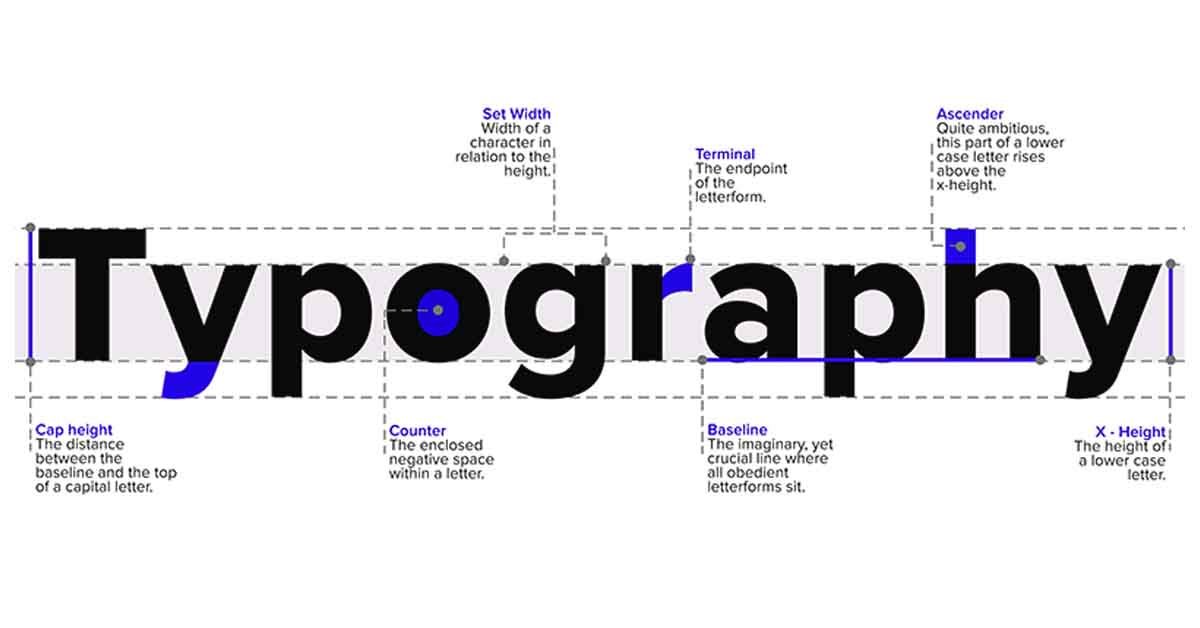
Understanding Typography Basics
Before diving into tips, it’s crucial to understand some basic typography concepts:
1. Typeface vs. Font
- Typeface: The design of the letters, numbers, and symbols (e.g., Arial, Times New Roman).
- Font: A specific style within a typeface (e.g., Arial Bold, Times New Roman Italic).
2. Serif vs. Sans Serif
- Serif: Fonts with small lines or strokes attached to the ends of letters (e.g., Times New Roman, Georgia). They are considered traditional and are often used in print.
- Sans Serif: Fonts without the extra strokes (e.g., Arial, Helvetica). They are modern and clean, making them ideal for digital screens.
3. Script and Decorative Fonts
- Script: Fonts that mimic cursive handwriting (e.g., Brush Script, Pacifico). They are elegant but should be used sparingly.
- Decorative: Unique and stylized fonts that are great for attention-grabbing elements but not for body text (e.g., Comic Sans, Impact).
4. Font Weight and Style
- Weight: Refers to the thickness of the characters (e.g., Light, Regular, Bold).
- Style: Variations such as Italic, Condensed, or Extended.
Tips for Choosing the Right Fonts
1. Define Your Purpose and Audience
Consider the purpose of your project and your target audience. For example, a playful script font might be suitable for a children’s brand but inappropriate for a corporate report.
2. Focus on Readability
Ensure your chosen fonts are easy to read, especially for body text. Avoid overly decorative or complex fonts for large blocks of text.
3. Limit Your Font Choices
Using too many fonts can create a chaotic look. Stick to two or three complementary fonts to maintain a cohesive design.
4. Consider Font Pairing
When pairing fonts, aim for contrast and balance. Combining a serif with a sans serif is a classic approach. Ensure that the fonts complement each other without clashing.
5. Test in Different Sizes and Contexts
Check how your fonts look in various sizes and on different devices. What works on a desktop might not be as effective on a mobile screen.
6. Pay Attention to Kerning and Leading
- Kerning: The space between individual characters. Adjusting kerning can improve readability.
- Leading: The space between lines of text. Proper leading ensures your text isn’t too cramped or too spaced out.
Tips for Pairing Fonts Like a Pro
1. Combine Serif and Sans Serif
Pairing a serif font for headings with a sans serif font for body text creates a balanced, professional look. This combination leverages the traditional feel of serifs with the modern clarity of sans serifs.
2. Match the Mood
Ensure that the fonts you pair convey the same tone. For instance, don’t pair a formal serif with a playful script unless you’re deliberately creating a contrast for a specific effect.
3. Use Font Families
Some typefaces come with multiple weights and styles, known as a font family. Using different styles within the same family can provide variety while maintaining consistency.
4. Create Hierarchy
Use font size, weight, and style to establish a visual hierarchy. Headlines should stand out more than subheadings and body text. This guides the reader’s eye through the content.
5. Contrast Font Weights
Pair a bold font with a lighter one to create visual interest and emphasis. This technique is effective for highlighting important information.
6. Use Online Tools
Leverage tools like Google Fonts, Font Pair, or Adobe Fonts to explore and test different font pairings. These resources often suggest popular combinations that work well together.
Common Mistakes to Avoid
1. Overusing Decorative Fonts
Decorative fonts are eye-catching but can be overwhelming if overused. Limit their use to headlines or specific design elements.
2. Ignoring Readability
Fancy fonts might look good, but if they’re hard to read, they defeat the purpose. Always prioritize readability, especially for body text.
3. Poor Contrast
Ensure there is enough contrast between your text and background. Light gray text on a white background, for example, can be difficult to read.
4. Inconsistent Styling
Maintain consistency in your typography choices. Using too many different fonts and styles can create a disjointed look.
Conclusion
Mastering typography is key to creating visually appealing and effective designs. By understanding the basics, choosing the right fonts, and pairing them thoughtfully, you can enhance the readability, aesthetics, and overall impact of your projects. Remember to consider your audience, test your designs in different contexts, and leverage online tools for inspiration. With these tips, you’ll be able to choose and pair fonts like a pro, elevating your design work to new heights.
By following these guidelines, you can harness the power of typography to create designs that not only look great but also communicate effectively. Start experimenting with different fonts and pairings today to discover what works best for your projects and audience.