Introduction
Color is a fundamental aspect of graphic design, influencing emotions, perceptions, and behaviors. Understanding color theory—the study of how colors interact and the effects they produce—enables designers to create visually appealing and effective designs that communicate the intended message.
The Basics of Color Theory
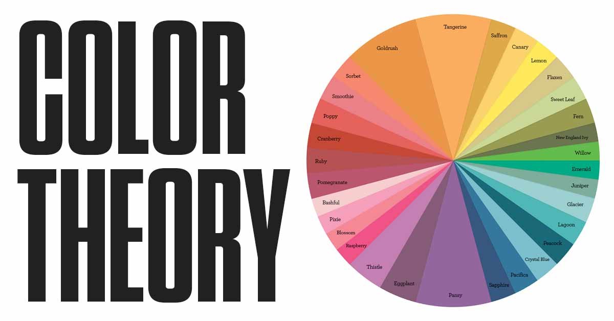
- The Color Wheel
- The color wheel is a circular diagram that shows the relationships between colors. It’s divided into primary, secondary, and tertiary colors:
- Primary Colors: Red, blue, and yellow. These colors cannot be created by mixing other colors.
- Secondary Colors: Green, orange, and purple. These are made by mixing two primary colors.
- Tertiary Colors: These are created by mixing a primary color with a neighboring secondary color.
- Color Harmonies
- Color harmonies are combinations of colors that are pleasing to the eye. Some common harmonies include:
- Complementary Colors: Colors that are opposite each other on the color wheel, like red and green. These create high contrast and can make elements stand out.
- Analogous Colors: Colors that are next to each other on the color wheel, like blue, blue-green, and green. These create a harmonious and cohesive look.
- Triadic Colors: A set of three colors that are evenly spaced around the color wheel, such as red, yellow, and blue. This scheme offers a high contrast while maintaining balance.
- Monochromatic Colors: Variations of a single color, using different shades, tints, and tones. This creates a subtle and cohesive look.
- Warm and Cool Colors
- Colors are often classified as warm or cool:
- Warm Colors: Red, orange, and yellow are associated with warmth, energy, and excitement. They can make designs feel more inviting and active.
- Cool Colors: Blue, green, and purple are calming and soothing, often associated with tranquility and professionalism.
- Color Value, Saturation, and Hue
- Hue: The basic color itself (e.g., red, blue).
- Saturation: The intensity or purity of the color. High saturation means the color is vivid and strong, while low saturation means it’s muted and dull.
- Value: The lightness or darkness of a color. Adding white creates a tint, adding black creates a shade, and adding gray creates a tone.
The Psychological Impact of Colors
- Red
- Red is associated with passion, energy, and urgency. It can grab attention and evoke strong emotions, which is why it’s often used in advertising, especially in calls to action.
- Blue
- Blue is calming and trustworthy, often associated with professionalism, reliability, and peace. It’s commonly used in corporate and healthcare designs to create a sense of security and stability.
- Yellow
- Yellow is cheerful and uplifting, associated with happiness and warmth. It can evoke optimism and positivity, but too much yellow can cause visual fatigue, so it’s best used as an accent color.
- Green
- Green symbolizes nature, growth, and health. It’s commonly used in designs related to the environment, wellness, and finance, as it also conveys a sense of balance and tranquility.
- Purple
- Purple is often associated with luxury, creativity, and spirituality. It can evoke a sense of mystery or sophistication, making it popular in beauty and fashion industries.
- Black
- Black is powerful, elegant, and formal. It can create a strong, authoritative presence and is often used in luxury branding. However, excessive use of black can feel heavy or overwhelming.
- White
- White represents purity, simplicity, and cleanliness. It’s often used in minimalist designs and can create a sense of space and openness.
- Orange
- Orange is vibrant and energetic, symbolizing enthusiasm and creativity. It’s a friendly and inviting color, often used to draw attention without being as overwhelming as red.
Applying Color Theory in Design
- Creating Mood and Atmosphere
- Use color to set the tone of your design. For example, a cool color palette can create a calm and professional atmosphere, while warm colors can evoke energy and excitement.
- Guiding the Viewer’s Eye
- Color can be used strategically to draw attention to key elements, such as calls to action or important information. High-contrast colors can highlight these elements effectively.
- Building Brand Identity
- Consistent use of color in branding helps in building brand recognition and conveying the brand’s values. Choose colors that align with the brand’s personality and message.
- Enhancing Readability
- Ensure that the text and background colors have sufficient contrast to make the content easy to read. Avoid combinations that strain the eyes or make the text hard to discern.
- Considering Cultural Associations
- Be aware of cultural differences in color perception. For example, while white is associated with purity in Western cultures, it can signify mourning in some Eastern cultures.
Case Studies: Effective Use of Color in Design
- Coca-Cola
- Coca-Cola’s use of red and white is instantly recognizable and creates a sense of excitement and energy. The color scheme has been consistent for decades, reinforcing the brand’s identity.
- Apple
- Apple’s use of white and minimalistic design elements creates a sense of simplicity, elegance, and innovation. The clean color palette reflects the brand’s focus on user-friendly, cutting-edge products.
- Spotify
- Spotify’s use of green as the primary color is associated with growth and creativity. The contrasting use of white and black for text ensures readability and a modern look.
Conclusion
Color theory is a powerful tool in graphic design that can greatly influence how a design is perceived and its overall effectiveness. By understanding the relationships between colors, their psychological impact, and how to apply them in various contexts, designers can create visually compelling and emotionally resonant work. Whether you’re creating a logo, a website, or a marketing campaign, a thoughtful approach to color can enhance the message, create the desired mood, and leave a lasting impression on the audience.