Introduction
Visual hierarchy is a fundamental principle in graphic design that guides the viewer’s eye through a composition, ensuring that the most important elements are seen first. By organizing content in a clear and intentional way, designers can create effective and engaging designs that communicate messages efficiently. Understanding and applying the principles of visual hierarchy can transform a cluttered layout into a well-structured design that resonates with the audience.
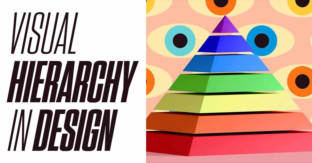
What is Visual Hierarchy?
Visual hierarchy refers to the arrangement and presentation of elements in a design in order of importance. It is achieved by manipulating size, color, contrast, alignment, spacing, and other design elements to guide the viewer’s attention. The goal is to make it easy for the viewer to understand the message by leading them through the content in a logical and intuitive way.
The Importance of Visual Hierarchy in Design
- Improves Readability and Usability
- A strong visual hierarchy makes it easier for viewers to process information. By organizing content in a clear, structured way, designers help users find what they’re looking for quickly, whether on a website, in a brochure, or in an app.
- Enhances User Experience
- Visual hierarchy contributes to a positive user experience by reducing cognitive load. When information is presented logically, users don’t have to work as hard to understand it, making the experience more enjoyable and effective.
- Conveys the Message Clearly
- By emphasizing key elements, visual hierarchy ensures that the most important information is communicated effectively. This is especially important in marketing and advertising, where the goal is to capture attention and convey a message quickly.
- Supports Branding
- Consistent use of visual hierarchy across different platforms and materials reinforces brand identity. It helps maintain a cohesive look and feel, ensuring that the brand’s message is always clear and recognizable.
Key Elements of Visual Hierarchy
- Size and Scale
- Size is one of the most powerful tools in establishing visual hierarchy. Larger elements naturally draw more attention and are perceived as more important than smaller ones. For example, in a website layout, the headline is usually larger than the body text, signaling its importance.
- Color and Contrast
- Color and contrast can be used to create emphasis and differentiate elements. Bright or bold colors draw attention, while muted or neutral colors recede into the background. High contrast between elements can make them stand out, while low contrast can create a sense of cohesion.
- Typography
- The use of different typefaces, weights, and sizes can establish a clear hierarchy. Headings, subheadings, and body text should be distinctly different to guide the reader through the content. For example, using a bold, sans-serif font for headlines and a lighter serif font for body text can create a clear visual hierarchy.
- Alignment and Placement
- The placement of elements within a design also affects hierarchy. Elements aligned to the left or top of the composition are often perceived as more important. Centered elements can draw attention, while those placed on the periphery may be seen as less significant.
- Whitespace
- Whitespace, or negative space, is the empty space around and between elements in a design. It allows elements to “breathe” and helps to group related content. By using whitespace effectively, designers can separate different sections of content and create a cleaner, more focused layout.
- Repetition and Patterns
- Repetition of design elements, such as shapes, colors, or fonts, can create rhythm and cohesion in a design. Patterns help to establish a visual hierarchy by guiding the viewer’s eye through the composition in a predictable way.
- Proximity
- Proximity refers to the spatial relationship between elements. Grouping related items together visually indicates that they are connected. For example, placing a label close to its corresponding form field in a web form creates a clear association.
- Visual Cues
- Arrows, lines, icons, and other visual cues can be used to direct attention and establish hierarchy. These elements act as guides, leading the viewer from one part of the design to another in a deliberate sequence.
Creating Visual Hierarchy in Different Types of Design
- Web Design
- In web design, visual hierarchy is crucial for guiding users through the content. Key elements like navigation menus, call-to-action buttons, and headlines should be prominent and easy to find. Use size, color, and contrast to differentiate these elements from less critical content.
- Print Design
- In print design, such as brochures or posters, visual hierarchy helps communicate the message at a glance. Headlines should be bold and large, while supporting text can be smaller and less prominent. Images and graphics should be placed strategically to draw attention to key information.
- Mobile Design
- Mobile design requires careful consideration of visual hierarchy due to the limited screen space. Prioritize content by placing the most important elements at the top of the screen and using touch-friendly design elements. Ensure that text is legible and that buttons are easily tappable.
- Packaging Design
- In packaging design, visual hierarchy is used to highlight the product name, brand logo, and key features. The most important information should be the most prominent, while secondary details can be smaller or placed on the back of the package.
Practical Tips for Building Strong Visual Hierarchy
- Start with a Clear Focal Point
- Identify the most important element in your design and make it the focal point. This could be a headline, an image, or a call-to-action button. Use size, color, or placement to draw attention to this element first.
- Create a Flow
- Establish a logical flow that guides the viewer’s eye through the content in the desired order. Use alignment, spacing, and visual cues to create a path that leads from one element to the next.
- Use a Grid System
- A grid system can help you organize elements consistently and maintain a clear hierarchy. Grids provide a structure that ensures elements are aligned and spaced evenly, contributing to a cohesive design.
- Limit the Use of Fonts and Colors
- Stick to a limited palette of fonts and colors to avoid overwhelming the viewer. Too many different styles can create visual clutter and confuse the hierarchy. Instead, use variations in weight, size, and color within a consistent set of styles.
- Test Your Design
- Before finalizing your design, test it with users or colleagues to ensure the visual hierarchy is clear and effective. Ask them to identify the most important elements and see if they navigate the content as intended.
Case Studies: Effective Use of Visual Hierarchy
- Apple’s Website
- Apple’s website is a prime example of strong visual hierarchy. The large, bold headlines and high-quality images draw the viewer’s attention immediately, while the clean, minimalistic design ensures that the focus remains on the product. The use of whitespace and consistent typography further enhances the clarity and flow of the content.
- The New York Times
- The New York Times’ print and digital layouts demonstrate effective visual hierarchy in editorial design. Headlines are large and bold, while subheadings and body text are smaller and more detailed. Images are placed strategically to break up the text and draw attention to key stories.
- Nike’s Advertising Campaigns
- Nike’s advertising campaigns often feature strong visual hierarchy, with powerful images and minimal text. The brand’s slogan and logo are typically prominent, while the overall design is kept clean and focused on the message of empowerment and performance.
Conclusion
Visual hierarchy is a critical aspect of graphic design that ensures your content is communicated effectively and efficiently. By understanding and applying the principles of visual hierarchy, you can create designs that are not only aesthetically pleasing but also functional and user-friendly. Whether you’re designing for print, web, or mobile, a strong visual hierarchy will guide the viewer’s eye, emphasize the most important elements, and ultimately enhance the impact of your work. As you continue to develop your design skills, keep these principles in mind to create compelling, clear, and engaging compositions.