Color is a powerful tool in design that can evoke emotions, convey messages, and create visual interest. Understanding color theory is essential for choosing the right palette for your projects, whether you’re designing a website, a brand logo, or a marketing campaign. In this detailed guide, we’ll explore the basics of color theory and provide practical tips for selecting the perfect color palette.
What is Color Theory?
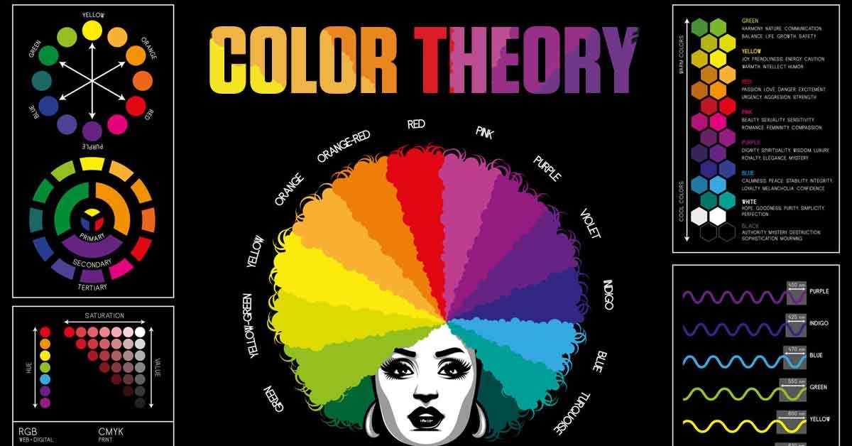
Color theory is the study of how colors interact with each other and how they can be combined to create harmonious designs. It involves understanding the color wheel, color relationships, and the psychological effects of colors.
The Color Wheel
The color wheel is a circular diagram that shows the relationship between different colors. It is divided into primary, secondary, and tertiary colors.
1. Primary Colors
- Red
- Blue
- Yellow
Primary colors cannot be created by mixing other colors. They are the foundation of all other colors on the wheel.
2. Secondary Colors
- Green (Blue + Yellow)
- Orange (Red + Yellow)
- Purple (Red + Blue)
Secondary colors are created by mixing two primary colors.
3. Tertiary Colors
Tertiary colors are created by mixing a primary color with a neighboring secondary color. Examples include:
- Red-Orange
- Yellow-Green
- Blue-Purple
Color Relationships
Understanding how colors relate to each other on the color wheel is crucial for creating harmonious palettes. Here are the main types of color relationships:
1. Complementary Colors
Complementary colors are opposite each other on the color wheel. Examples include:
- Red and Green
- Blue and Orange
- Yellow and Purple
Using complementary colors can create high contrast and vibrant designs, but they should be balanced to avoid overwhelming the viewer.
2. Analogous Colors
Analogous colors are next to each other on the color wheel. Examples include:
- Blue, Blue-Green, Green
- Red, Red-Orange, Orange
Analogous color schemes are harmonious and pleasing to the eye, making them ideal for creating cohesive designs.
3. Triadic Colors
Triadic colors are evenly spaced around the color wheel, forming a triangle. Examples include:
- Red, Yellow, Blue
- Green, Orange, Purple
Triadic color schemes are vibrant and balanced, offering a high level of contrast while maintaining harmony.
4. Split-Complementary Colors
Split-complementary colors include a base color and the two colors adjacent to its complementary color. Examples include:
- Blue, Yellow-Orange, Red-Orange
- Red, Blue-Green, Yellow-Green
Split-complementary schemes offer contrast with less tension than complementary schemes, making them versatile and dynamic.
5. Tetradic Colors
Tetradic colors, or double-complementary colors, form a rectangle on the color wheel. Examples include:
- Red, Green, Blue, Orange
- Yellow, Purple, Blue, Orange
Tetradic schemes offer rich color combinations but require careful balancing to avoid chaotic designs.
The Psychology of Color
Colors can evoke specific emotions and associations, which is crucial for effective design. Here’s a brief overview of common color meanings:
1. Red
- Emotion: Passion, energy, urgency
- Usage: Call-to-action buttons, sales, food industry
2. Blue
- Emotion: Trust, calm, professionalism
- Usage: Corporate branding, healthcare, technology
3. Yellow
- Emotion: Happiness, warmth, attention
- Usage: Warnings, children’s products, leisure
4. Green
- Emotion: Growth, health, tranquility
- Usage: Environmental products, finance, wellness
5. Purple
- Emotion: Luxury, creativity, spirituality
- Usage: Beauty products, education, non-profits
6. Orange
- Emotion: Enthusiasm, fun, caution
- Usage: Entertainment, food, sports
7. Black
- Emotion: Sophistication, elegance, power
- Usage: Luxury brands, fashion, technology
8. White
- Emotion: Purity, simplicity, cleanliness
- Usage: Healthcare, minimalistic designs, high-tech
Tips for Choosing the Right Color Palette
1. Define Your Purpose and Audience
Consider the purpose of your project and your target audience. Choose colors that resonate with your audience’s preferences and convey the intended message effectively.
2. Start with a Dominant Color
Select a dominant color that aligns with your brand or project’s primary emotion or message. This color will be the foundation of your palette.
3. Use Color Relationships
Utilize the color wheel to create harmonious color schemes. Experiment with complementary, analogous, triadic, or split-complementary schemes to find the best combination.
4. Consider Color Psychology
Incorporate colors that evoke the desired emotions and associations for your project. Be mindful of cultural differences in color meanings if your audience is global.
5. Limit Your Palette
Avoid using too many colors, which can overwhelm the viewer. A palette of three to five colors is typically effective for most designs.
6. Test and Iterate
Test your color palette on different devices and in various lighting conditions. Make adjustments as needed to ensure consistency and readability.
7. Use Tools and Resources
Leverage online tools like Adobe Color, Coolors, or Canva’s Color Palette Generator to explore and create cohesive color schemes easily.
Conclusion
Mastering color theory and choosing the right palette can significantly enhance the impact of your designs. By understanding the color wheel, color relationships, and the psychology of colors, you can create harmonious and emotionally resonant designs. Follow these tips to select the perfect color palette for your projects, ensuring they are visually appealing and effective.
By applying the principles of color theory and carefully selecting your palette, you can create designs that not only look great but also communicate your message powerfully. Start experimenting with colors today and elevate your design projects to the next level.