Introduction
Graphic design is not merely about creating visually appealing images; it’s a language that communicates with the audience on a subconscious level. One crucial aspect of this visual language is color, and understanding color psychology can significantly impact the effectiveness of a design. In this article, we’ll explore the intricacies of color psychology in graphic design and how to choose the right palette for maximum impact.
In the world of graphic design, color is more than just a visual element; it’s a powerful tool that can evoke emotions, convey messages, and establish brand identity. The connection between color and psychology is profound, influencing how people perceive and react to visual stimuli.
Understanding Color Psychology
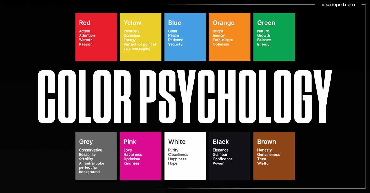
Color psychology delves into the emotional and psychological impact of different colors. Each color has unique associations and can trigger specific responses. For instance, warm colors like red and orange are often associated with energy, passion, and urgency, while cool colors like blue and green evoke calmness and tranquility.
Color Schemes in Graphic Design
Designers often use various color schemes to create harmony and balance in their compositions. Monochromatic, analogous, complementary, and triadic color schemes offer different visual experiences, allowing designers to tailor their choices based on the desired emotional response.
The Role of Warm and Cool Colors
Warm colors can stimulate and energize, while cool colors have a calming effect. Understanding the psychological impact of these color groups enables designers to strategically use them to influence the viewer’s mood and perception.
Choosing the Right Color Palette
Selecting the right color palette involves considering factors such as brand identity, target audience, and cultural influences. Achieving color harmony and contrast is crucial for creating visually appealing and effective designs.
Application of Color in Branding
Brands often use specific colors to convey their identity and values. Successful examples include the vibrant red of Coca-Cola or the calming blue of Facebook. However, it’s essential to avoid common mistakes, such as cultural misinterpretations or overused color combinations.
Color Trends in Graphic Design
Staying aware of current color trends is important, but designers must balance trendiness with timelessness. Analyzing successful designs can provide insights into how to incorporate trendy colors without sacrificing long-term appeal.
Tools for Selecting Color Palettes
Numerous online tools assist designers in selecting harmonious color palettes. Additionally, ensuring accessibility in color choices is vital to cater to diverse audiences and enhance the overall user experience.
Case Studies
Examining case studies of successful graphic designs offers practical insights into the effective application of color psychology. From iconic logos to memorable marketing materials, understanding the role of color in these cases is invaluable.
Effects of Color on User Experience
Colors significantly impact user experience, especially in web design. Thoughtful color schemes can enhance navigation, readability, and overall user engagement, influencing how visitors perceive and interact with a website.
Incorporating Color Psychology in Web Design
Implementing color psychology in web design involves considering the user’s emotional response to different color combinations. From creating a cohesive brand image to guiding users through a seamless experience, color plays a crucial role in shaping online interactions.
Cultural Variations in Color Perception
Color interpretations can vary across cultures, making it essential for global brands to adapt their designs accordingly. Being aware of cultural nuances helps prevent misunderstandings and ensures designs resonate positively with diverse audiences.
Addressing Color Accessibility
Designers must prioritize color accessibility to make their creations inclusive. Considering factors like contrast, legibility, and color blindness ensures that everyone can engage with and appreciate the visual content.
The Future of Color in Graphic Design
As technology advances, new possibilities in color usage emerge. Predicting upcoming color trends and staying at the forefront of innovations allows designers to push the boundaries of creativity and visual communication.
Conclusion
In conclusion, color psychology is a fundamental aspect of graphic design that should not be overlooked. Thoughtful consideration of color choices can elevate a design from visually pleasing to emotionally impactful. Whether crafting a brand identity, designing a website, or creating marketing materials, understanding the psychology of color is a powerful tool in the hands of a skilled graphic designer.
FAQs:
- How does color impact brand perception?
- Brand perception is significantly influenced by color, as specific colors evoke certain emotions and associations.
- Are there cultural differences in color preferences?
- Yes, different cultures may interpret colors differently, emphasizing the importance of cultural awareness in design.
- What role does color play in website accessibility?
- Color choices affect accessibility, and designers must consider factors like contrast and legibility for an inclusive user experience.
- Can using trendy colors in design negatively impact a brand in the long term?
- While incorporating trends is essential, overreliance on trendy colors without considering timelessness can affect a brand’s long-term appeal.
- How can designers balance creativity with color accessibility?
- Designers can balance creativity with accessibility by using online tools, considering cultural nuances, and prioritizing inclusive color choices.