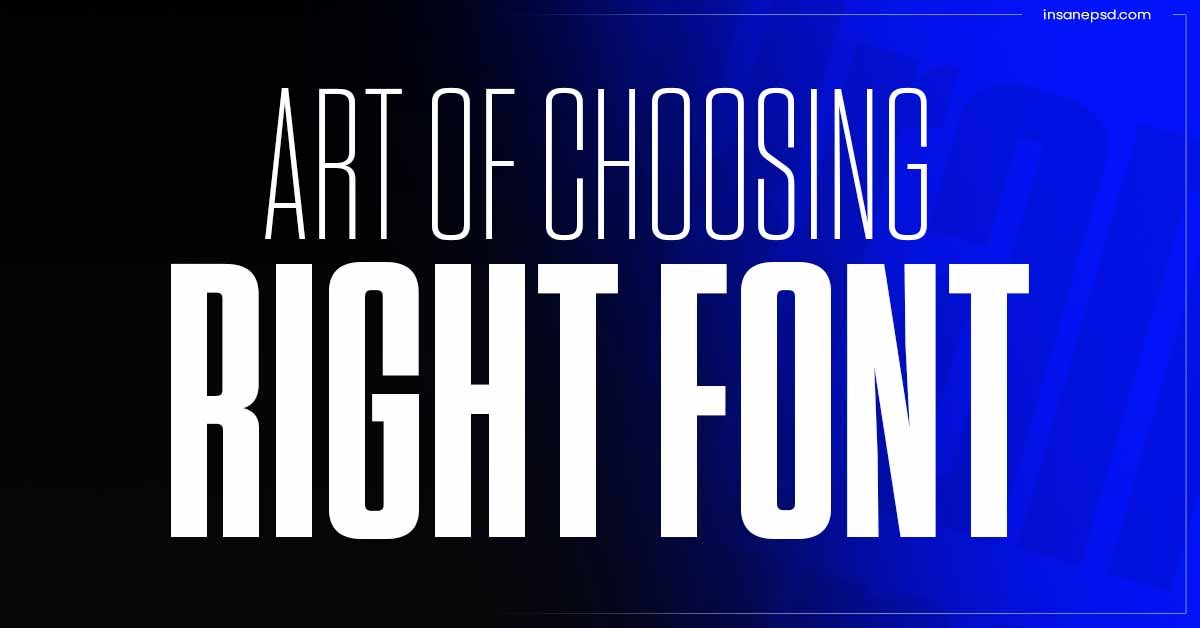
I. Introduction
Typography is not just about selecting fonts; it’s an art that influences how your content is perceived by the audience. In this guide, we’ll delve into the world of typography, uncovering the secrets of choosing and pairing fonts like a professional designer.
A. Importance of Typography
Typography plays a crucial role in visual communication. It goes beyond the mere selection of fonts; it’s about creating an immersive and engaging experience for the reader. The right typography can enhance the message and leave a lasting impression.
B. Impact on User Experience
A well-thought-out typographic design can significantly impact the user experience on websites, apps, or any visual content. Users are more likely to engage with content that is visually appealing and easy to read.
II. The Basics of Typography
A. Understanding Fonts
1. Serif Fonts
Serif fonts, with their decorative strokes, convey a sense of tradition and formality. They are often used in print media for a classic look.
2. Sans-serif Fonts
Sans-serif fonts, without the extra strokes, offer a clean and modern aesthetic. They are popular for digital content and websites.
3. Script Fonts
Script fonts mimic handwriting and add a personal touch. They are often used for creative and informal designs.
B. Font Size and Line Spacing
The size of your font and the spacing between lines are critical for readability. Finding the right balance ensures a comfortable reading experience.
C. Font Weight and Style
Font weight and style contribute to the overall tone of your content. Bold fonts may convey strength, while italicized fonts can add emphasis or a touch of elegance.
III. Choosing Fonts Wisely
A. Matching Fonts with Brand Identity
Your choice of fonts should align with your brand identity. Fonts convey brand personality and values, contributing to brand recognition.
B. Considering Readability
Prioritize readability over creativity. Fancy fonts may look appealing, but if they compromise readability, they can drive readers away.
C. Reflecting Tone and Mood
Fonts convey emotions. Choose fonts that resonate with the tone and mood of your content. Playful fonts work well for casual content, while sophisticated fonts may suit formal settings.
IV. Font Pairing Techniques
A. Complementary Font Pairing
Pair fonts that complement each other. This creates a harmonious design where each font has its distinct role without overshadowing the other.
B. Contrasting Font Pairing
Contrast adds visual interest. Pairing a bold font with a delicate one can create a dynamic and eye-catching composition.
C. Using Font Families
Font families offer a cohesive look. Utilize fonts from the same family for a consistent design across different elements.
V. Web-Friendly Fonts
A. Importance of Web-Safe Fonts
Ensure your chosen fonts are web-safe to guarantee consistent appearance across various browsers and devices.
B. Google Fonts and Other Web Font Resources
Explore web font resources like Google Fonts, Adobe Fonts, or other platforms offering a wide range of fonts optimized for the web.
VI. Avoiding Common Typography Mistakes
A. Too Many Fonts
Limit the number of fonts used in a design. Overloading with fonts can create confusion and disrupt the visual flow.
B. Inconsistent Font Sizes
Maintain consistency in font sizes for a polished look. Inconsistencies can distract readers and affect the overall design.
C. Ignoring Accessibility
Consider accessibility standards. Ensure your typography is easily readable for all users, including those with visual impairments.
VII. Tools for Typography
A. Adobe Fonts
Adobe Fonts provides an extensive library of fonts suitable for various design projects. Explore their collection to find the perfect match for your content.
B. Google Fonts Plugin
Integrate Google Fonts into your website seamlessly using plugins. This allows you to easily experiment with different fonts.
C. Font Pairing Websites
Use online tools and websites dedicated to font pairing. They provide suggestions and combinations that can save time and effort.
VIII. Responsive Typography
A. Ensuring Readability Across Devices
Optimize typography for responsiveness. Ensure your chosen fonts maintain readability on different devices and screen sizes.
B. Media Queries for Fonts
Use CSS media queries to adapt font sizes based on the device. This enhances the overall user experience on various platforms.
IX. Trends in Typography
A. Variable Fonts
Variable fonts allow for dynamic adjustments in weight, width, and slant. Explore this trend for flexible and responsive typography.
B. Handwritten Fonts
Handwritten fonts add a personal touch and are increasingly popular for conveying authenticity.
C. Overlapping Text Effects
Experiment with creative overlapping text effects to add visual interest to your designs.
X. Case Studies
A. Successful Font Pairing Examples
Explore case studies showcasing brands that effectively use font pairing to create memorable designs.
B. Brands with Impactful Typography
Highlight brands known for their impactful use of typography, contributing to their overall brand image.
XI. Tips for DIY Typography
A. Exploring Font Combinations
Experiment with different font combinations to find a unique style that aligns with your content and brand